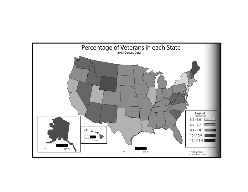
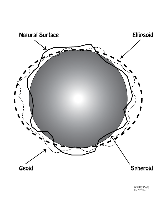
FINAL MAP.............Fall 2014!!!
Wednesday, December 10, 2014
Tuesday, November 18, 2014
LAB 10 Bi variate Map
Since I'm a bit of a golf nut I thought I would see what the total area for each county was and then figure out how many golf courses each had based on a 20 mile radius from its county seat. Then the idea would be to see if by playing a round at those courses, could you cover the total distance of the county.
Tuesday, November 4, 2014
For my final project I have chosen to create a map of the
United States spending for financial Aid to other foreign nations. I find this
topic fascinating because it ties in nicely with my areas of study. We have
always heard of the US dolling out monetary funds to other Nations for
assistance with economic development, military assistance or for other unknown
reasons. I have seen other maps that have been created for this subject but
would like to attempt it myself.
For the basic layout of the map I will attempt for fins a
base map using ArcGIS. I will try and use a map that will show the world for
what it is. I believe that an equal area type of map possibly a cylindrical map
will allow me to show my data in an interesting way. In this I will also try
and find a map that not contain Antarctica since this should contain no data.
For the way that I will attempt to convey the data that I find I will lean for
either a Choropleth map or if needed maybe even try for a proportional symbol
map if I could find a way to not have the map look cluttered.
I have already begun to look for my data that I will need
and have found that the US Census bureau list the amount of aid that the US
gave to other nations in 2009. The data is listed in dollar amount in millions
of dollars. I will have to figure out which method to use to break the data
down into classes but as of right now I believe that I could use something
along the lines of equal intervals. If I am unable to find a nice way to divide
the data into good groupings I may look to see if there are natural breaks.
Scheduling the making of this map should not be very hard at
this moment. For the most part I believe the largest requirement of time that I
shall have will be the gathering of everything that I need and converting it
all into a usable format just before the actual map making process itself. I expect this portion of the process to
really take me no more than 1.5-2 weeks as of right now with my time constraints
as they are. I am looking to have a map ready to critique around Thanksgiving
which should give me enough time to go bac and fix anything that may come forth
with observation and suggestion.
Tuesday, October 28, 2014
Tuesday, October 21, 2014
Saturday, September 27, 2014
Thursday, September 25, 2014
Blog Map # 4
A college map for Marist College in NY. This is a really nice visual representation of the campus. Particularly I like the look of the map in regards to the scenery. The addition of the river with a boat and the fall foliage are a nice aspect of the map. Also of not the compass rose in the athletic fields is a nice way to make sure it was inserted into the map while keeping the map visually pleasing.
Tuesday, September 23, 2014
Wednesday, September 10, 2014
Interesting Map projections
While pretty boring I think this Pseudocylindrical map is kind of interesting. Its I guess a type of conic projection that will cut off certain areas like that seen above killing off central Asia. I bet they're none to happy about a projection like this.
http://members.shaw.ca/quadibloc/maps/mpse04.htm
Even crazier looking...
This one is a Loximuthal projection? Not sure....but it looks like someone sat on the globe and forgot to round it back out...
http://www.quadibloc.com/maps/mpse04.htm
Tuesday, September 9, 2014
Thursday, August 28, 2014
First Post!
After a pain in the ass attempt to start this Blog I've finally got it going. So here we are. I guess the first assignment is to post an interesting map right. I guess I'll go overboard and use a few.
http://oceanservice.noaa.gov/news/features/oct11/hurricanetracks.html
This first one show the intensity and amount of Tropical Storms/Hurricanes around the world. Its an interesting map for me since over the summer I took a Physical Climatology Class and as my final project I did a study of just this.
http://oceanservice.noaa.gov/news/features/oct11/hurricanetracks.html
http://www.boredpanda.com/maps-show-how-americans-feel-about-different-states/
I have family in Mass so their accent is that weird to me. Neither is Louisiana....I was born in Missippi.
http://seaworldparks.com/en/buschgardens-williamsburg/park-info/map/
Last one I swear but who didn't enjoy these as a kid? it was our first introduction to maps!
Subscribe to:
Comments (Atom)


.jpg)


.gif)


